
Call-to-action (CTA) buttons are used in the websites and on the landing pages to assist the viewer towards your goal of conversion. An effective landing page is something that triggers the user to click or take an action that you had wanted them to take. These buttons can be of any size and style based on the website style and goal conversion.
In this blog post, we will explore some of the popular Call to Action samples and guidelines from top brands to create an effective Call to Action button for your brand.
How CTA plays a vital role in marketing
CTA buttons play an essential role in encouraging your viewer to take action on a particular marketing campaign. The objective of any marketing campaign is to assist your audience in their buying journey that will eventually end up with making a purchase.
However, every marketing campaign does not need to have the same pattern. They have a various set of activities for the audience to execute because there are several strategies to assist your users in their buying journey. The usage of the tactics also depends on the brand and its purpose.
Below are some samples of the CTA types you can use in marketing:
Evernote
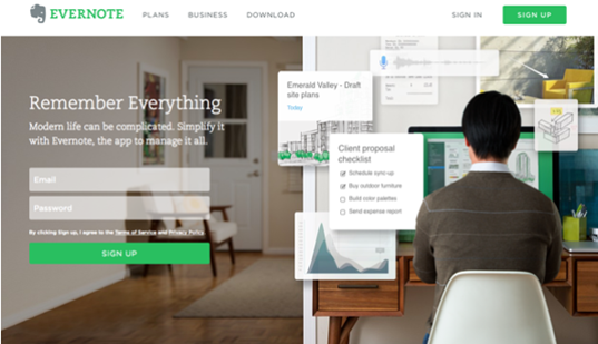
This is one of the simple and clear CTA, the two lines convey all the messages to the visitors by the moment they land on the Evernote’s landing page. Additionally, the page design, makes it simple for the audience to read and understand the quick advantages of using this app. The marketers had also made it easier to sign up. If you could see the green color of the CTA button “Sign Up” merges well with the Evernote logo and the headline.
Dropbox

Dropbox had always preferred and incorporated simple design if you could see the graphics placed on their homepage are simple and subtle. In reality, the subtle design of the page highlights the call-to-action button “Sign up for free” which stands out from all the elements on the page. The main strategy here is the CTA button “Sign up for Dropbox” is of the same color as the logo, so the audience can easily interpret the CTA button.
Netflix

The Netflix logo, sign in and the CT A “Join Free for a Month” all syncs together giving the easy interpretation for the users. Netflix also clears the hesitation of the users in the first look with the phrase “Cancel anytime” it highlights the users that it easier to cancel the subscription if users don’t like it and the CTA Join free for a month assures the users that the user can get free access for a month which can boost the SignUp rates.
Uber

Uber incorporates two CTA buttons “Sign up to drive” and “Start riding with Uber” targeting drivers and riders. Both these personas are seeking completely different things, so the website binds them together with the video playing in the background showing the drivers and riders with a good time in location across the world. Additionally, the phrase in the site design is a very simple and straightforward headline “Make money driving your car”.
Spotify

Spotify welcomes people to their site with two CTA buttons “Go Premium” and “Play for Free”. The CTAs are pretty simple and clear with its message that customers can subscribe for premium accounts who are willing to pay for it while others can sign up for free.
The attractive element of the site is not only about the headline and CTA buttons, but also about the coloring of the buttons. The CTA “Go Premium” is highlighted in lime green making it attractive among all the other elements on the page. The Play Free is designed with plain white that blends with the remaining part of the page. This color contrast makes sure that the users are attracted to the premium CTA button.
Guidelines
1. Use noticeable and appealing colors such as blue, green, and orange, and ensures that the CTAs are placed on contrasting backgrounds.
2. Keep the phrase simple and short (with not more than two to five words), yet making it still interesting. Try to add some action words and phrases.
3. Ensure to limit or not to add too much on-page competition, because the CTA button should only be the most attractive thing on the page.
4. Freebies, Discounts, and rewards are the best ways to entice the audience to click on the button.
5. Create a feeling of missing out or a sense of urgency to fetch some kind of reward.
6. CTA buttons should feature action-oriented and striking text. The action words should blend well with some specific particular text that relates to the offer like Reserve your seats now, Try Our Free Trial, Grab the offer now
7. The CTA button color matters a lot. Orange and Green buttons are proven to perform best. However, it all depends on the site design, because in general contrasting colors work effectively by making the striking buttons to stand out
8. CTA Button shape also plays an essential role in crafting the ideal CTA button. The decision of going along with the button with square edges or rounded button shape depends on your site design.
9. The CTA button text should be legible and large enough to read easily. Also make sure that it does not look obnoxious
Takeaway
Several factors can have an impact on the CTR (click-through rate) of the buttons, these can be summarized with some basic rules. Give a crisp and clear reason for the user stating what benefit they can obtain clicking on the button. Also, make the CTA button as attractive, noticeable, and enticing as much as possible, at the same time, it should not be annoying.
No Comments